About the Dashboard
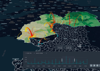
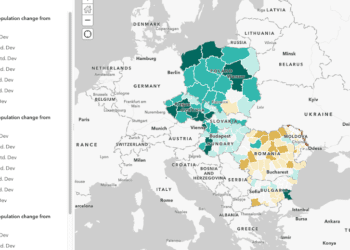
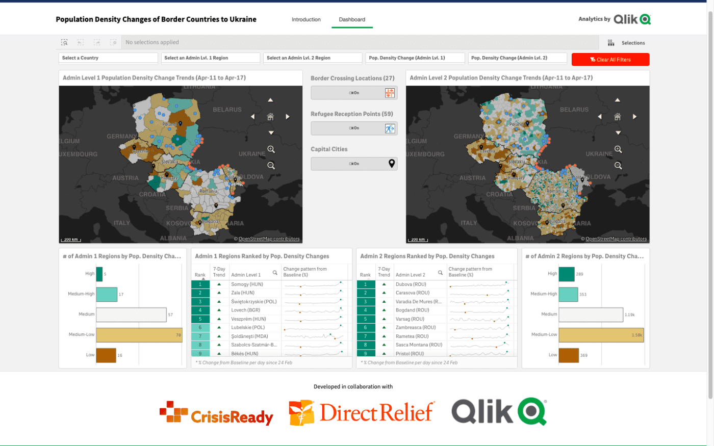
This interactive dashboard, developed in collaboration with Qlik and Direct Relief, shows population density changes in Bulgaria, Czechia, Poland, Hungary, Moldova, Romania, and Slovakia for a seven day period using anonymized and aggregated human mobility data from Meta (formerly Facebook.) Population density changes are determined by the date of acquisition compared to a 90-day average prior to the start of data collection in March 2020.
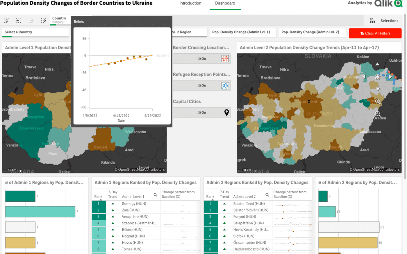
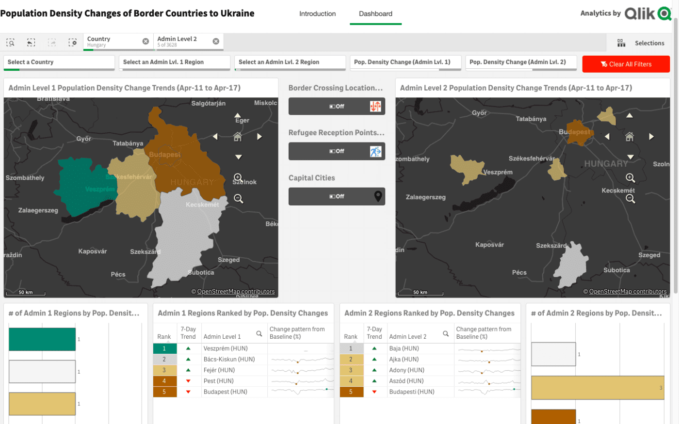
Users can explore the data at various geographic levels along with graphs that show patterns of change over time. Two map views (left and right) can be explored by changing the geographic focus (country, admin level) on the top bar, or by clicking on the specific area of interest. Hotspots, or areas of interest, are visualized using the following color levels:
- Low levels of population density change are shown in brown, which signify a small but consistent decrease in population density in these regions.
- High levels of population density changes are shown in cyan, which indicates a small but consistent increase in population densities in these regions.
These analyses of population density changes can indicate that people are leaving or coming-into a specific location at the time period of the analysis. This is not necessarily indicative of specific forced displacement, but likely one of the following scenarios from our remote analyses:
- Seasonal changes
- Fluctuations in the general population
- Changes in population, which may be related to displaced people from Ukraine
These maps are best used as a “signal” about population changes related to the Ukraine invasion. Its role is to help augment or add-to existing operational updates, conversations, and humanitarian information products or maps. Often, the resultant discussions can provide more context on what’s happening in the region.
Using the Dashboard
- Use the buttons on each page to navigate to different pages within the application.
- Make selections anywhere on the application using filter panes on the charts, themselves. Users may also make selections using the global search bar located in the top left corner of the dashboard. Users may clear and update selections on the top right of the dashboard screen by clicking the red buttoned labeled, “Clear All Filters.”
- Bookmarks can be made by clicking the icon located on the top right of the dashboard. A bookmark can be used to save a user’s view of the dashboard, including their sheet location and specified selections.
- Visualization options are available by right clicking on any visualization. Users may maximize the data visualization or object, download the data locally, and more.
For questions on how to use the interactive dashboard, please contact Joe Nallen.